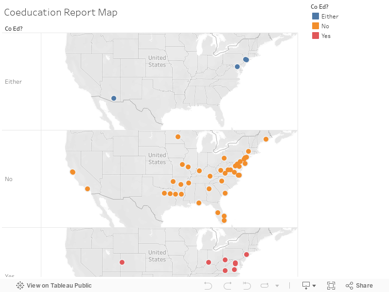
To create a map visualization, I used Tableau Public. This software was created by Christian Chabot, Chris Stolte, Andrew Beers, and Pat Hanrahan. They later sold the company to SalesForce. While this software is not open source, it is free to use. Tableau users can start up the software on a browser or downloaded application on any OS. To add data, enter editing mode and click the “New Data Source” icon. Upload your data in the form of a CSV file or Excel spreadsheet and then click “add.” To add layers to a map visualization, select map and then map layers. Users may then select the data they would like to display in the layer. To add shapes or pins to a visualization, users should find a folder of different shapes and pins under “My Tableau Repository.” To create a historical map, Tableau recommends using a “flow map” as they are best used to portray how something occurs over time. Users can select this map type under the “Show me” dropdown on the right side of the software’s interface pane. Tableau’s basemaps can originate from Google or OpenStreetMap and can be changed. Some example types of mapping projects that would suit this tool include identifying states/regions/cities with high or low frequencies of a variable. Tableau provides examples here. The Tableau Public software is markedly different from the software displayed in class. I believe it offers more in depth customization options for visualizations.
References:
https://help.tableau.com/current/pro/desktop/en-us/maps_howto_simple.htm