Data Visualizations:
Google Sheets: https://docs.google.com/spreadsheets/d/1MOd0-pGE0SpvKcVJhGMf6Dj2zZ29QFWuuC46ckZtRFI/edit#gid=0
RawGraphs: https://app.rawgraphs.io/
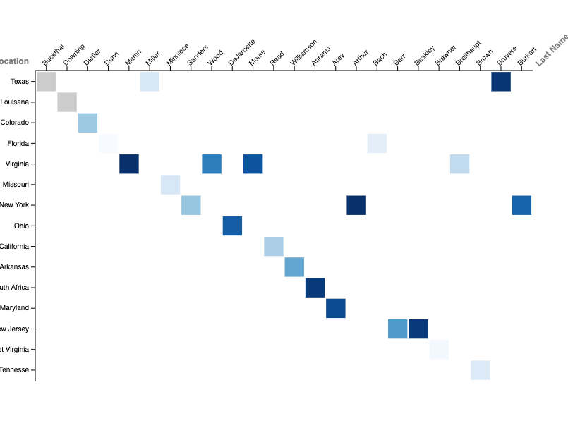
Crafting these data visualizations was surprisingly difficult. I found it hard to determine which graphs used which types of data (categorical or numerical). When I did make the determination, I found that I lacked much numerical data, limiting myself to a select few types of visualizations. I tried for hours to create a map of the United States, which I would use to display where each respondent was from, but I was unable to materialize the visualization. If I had more time, I would have collected more data and analyzed the purpose and meaning of each visualization both Google Sheets and RawGraphs offered. I used resources like Google to research creative ways to display data. In the future, to visceralize my data, I could add photos of the respondents to add a sense of weight and meaningfulness to the responses. I look forward to improving my ability to create graphics that enhance my future assignments in academia and professionally.